I finally finished the rocket camera project I started a while ago. Here's the finished product:
I got this idea from Make: Magazine. The original article is available in their online digital edition. Additional information related to the article can be found here.
All the instructions on how to hack the camera are available in the Make article so I won't bother repeating it here. More great information on hacking the camera is also available at camerahacking.com (that used to be the URL, but it currently doesn't work, the current working forum location can be found at camerahacks.10.forumer.com/)
More photos of the completed rocket:
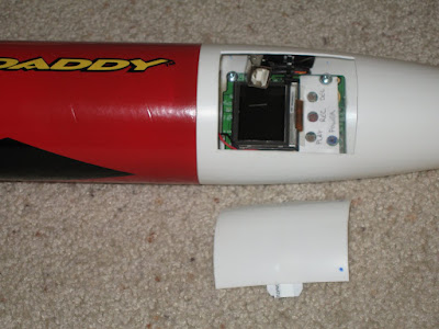
I glued some tabs (cut from an old plastic card...actually an old Disneyland passport) to the inside of the hatch door to allow it to "clip" in place. It took several tries to get the tabs on just right. The first tabs I glued on were configured differently and glued with epoxy. The door wasn't too secure (it felt loose) and the epoxy didn't hold. I tried again with the current tab layout with hot glue. That didn't hold either, but the door did seem more secure. So I glued them in the same place with plastic cement and that seems to be holding up much better. They've held strong now for 2 flights.
I do need to glue some tabs inside the nosecone though to prevent the door from falling inside. On the second flight I thought I lost the door, but it actually just slipped up inside the nosecone.
I used ShapeLock (a low temperature plastic) to plug the hole at the bottom of the nosecone to prevent the gases from the engine from getting into the nosecone and ruining the camera. This worked out well. While the inside of the body tube (and even some of the outer part of the nosecone) show scorch marks, the inside of the nosecone still looks perfect.
The camera is mounted using plastic standoffs that were glued in place with epoxy. So far, after 2 launches, the camera mounts seem to be doing just fine. Everything looks the same inside after the second launch as it did before the first.
The smaller battery (replacing the 2-AA original batteries to conserve weight) was mounted in a location where it can be easily replaced when/if necessary.
Of course, with a project like this the blog post wouldn't be complete without actual video from the rocket so here you go.
Launch #1:
The first launch was a huge success. Everything worked exactly as planned. Perfect (and impressive) launch. This was my first time using "E" size engines. Perfect chute deployment and a soft touch down. The camera worked exactly as I hoped.
Launch #2:
With the exception of the chute failure, this was also a good launch. Three of the six lines completely ripped free from the plastic chute. I'm not sure exactly what caused it. From the video though it looks like the rocket gets inverted just before the chute is deployed. In that position (I'm guessing) that the chute began to open and the body of the rocket either fell through the chute and caused several lines to tear loose, or the shock of the heavy body snapping against the cords caused it.
It was coming down pretty fast and I was very concerned it was going to hit the ground hard. There was no way I was going to let that happen so I ran after it to catch it. And catch it I did! Staying clear of the flailing body and nosecone I grabbed at the parachute and prevented the whole thing from smashing into the ground. The damage is pretty minimal and easily repaired, so this Big Daddy is going to fly again!
Sunday, August 30, 2009
Saturday, August 15, 2009
Pie Boxes - Part 2: The Picture
In Part 1 I documented the box construction. Here in Part 2 I'll be explaining the "magic" behind the making of the picture for the lid.
The box from Pushing Daisies has a very jolly looking man stuffing his face full of pie with the words "The Pie Hole" (the name of the Ned's pie shop). I scoured the web looking for the best possible image that I could use as a starting point. Unfortunately, one of the best ones I've found is shown below.
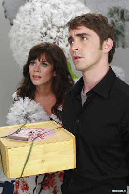
It's a great shot of the stars of the show, but not such a great shot of the image on the box. But it was the best I had so I gave it a try.
With GIMP I used the shear tool to stretch and manipulate the image until I had the picture as truly round as I could tell.
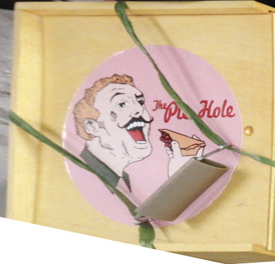
But the picture needed to be cleaned up significantly. Even if it's possible, my GIMP skills aren't good enough to remove the green string and improve the picture quality. So I took it to the analog realm. I printed it and traced it with pencil, then scanned the pencil sketch back into the computer.
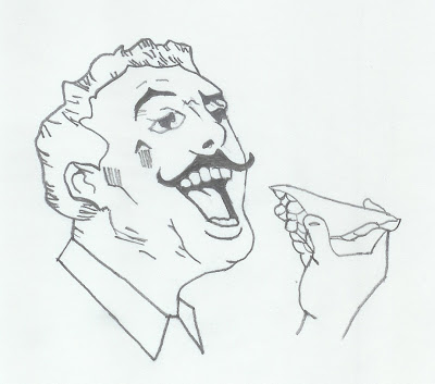
Some of the image was too fuzzy and half of the hand is missing, so some guesswork was involved.
After scanning it I used Inkscape to convert the bitmap into vectors.
A quick word on image editors: GIMP (or Photoshop and equivalents) are pixel editors. When you resize an image it either just makes the pixels bigger (making everything look "blocky") or it has to extrapolate information from the nearby pixels to make more pixels (making everything look "fuzzy"). The nice thing about Inkscape (or Illustrator and equivalents) is that it uses vectors - lines - to create the image. Of course, the computer is still displaying the lines as pixels, but the software doesn't need to guess at what the pixels should look like when resizing the image. The vector information tells it everything it needs to know. You can take a 1" x 1" image and blow it up to 10" x 10" and it will look just as good.
Of course, there are limitations to vector graphics as well. They are really only suitable for working with illustrations, not photos. But since I was working with an illustration here it was going to work out nicely.
Converting the drawing from a bitmap to vectors is easy in Inkscape, but getting things to look the way you want takes some fiddling around with the tool. I don't remember the exact settings I used for this particular image. But it's pretty easy to just tweak the settings, test, and adjust as you go. After I had the line drawing converted to a vector graphic I was more easily able to clean it up. There were a few "blotches" here and there that needed to be removed. Some holes that had to be filled. And some of the lines were not as smooth as I wanted and had to be smoothed out. I did like how the lines had a bit of texture to them so I left most of that in. I think it adds to the look.
I used the reference image to add color by just using the color picker tool. When using this tool if you just click on the reference color you are actually only selecting a pixel. And since the colors are usually made up of pixels of various colors (especially in this case) you may not get the color you wanted. But Inkscape gives you the ability to sample an area and it finds the average color.
Then after I finally had it looking the way I wanted, I was watching a newly aired episode of Pushing Daisies and they actually showed a pie box in a nice clear shot from the top down.
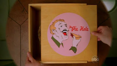
Ugh! I sure could have used this image earlier. It would have required all the same steps except the need to stretch it out to get it shaped right. But this image showed the missing wrist detail that I was missing from my other reference. So a little nip here and a tuck there I filled in the missing pieces and had a complete image.

April wanted the name of her blog on the image for her boxes. No problem. The text tool made that simple enough.

I have high resolution images available for download for anyone that wants them. They're available in JPEG, PNG, or SVG (for use with Inkscape or other vector graphic editors). I have 2 versions. One that has the text "Thank God It's Pie-day" and the other with the original "The Pie Hole."
You'll find the files here. Just right-click on the file you want to download, select "Save link as..." from the pop-up menu, then save it to a directory on your computer.
Feel free to alter and edit them for your own use. All I ask is that you don't make a profit off the image itself. Not that I personally care. But ABC might have something to say about it.
If anybody makes any significant improvements to it (especially to the Pie Hole text which I'm not entirely happy with how it turned out) please share it back with me. Just comment below and let me know how to get it.
Trying to find a way to put the image on the lid gave me the most concern. On the prop all they did was tack on a piece of paper. Again, for a prop that's fine. But in the real world it won't hold up to real use. And as you can probably see from the reference images, even the prop isn't holding up well with edges curling up.
Some ideas I tossed around in my head were:
1. Iron-on transfer - This would require some testing to see how well it would transfer to wood, if it would hold up to application of polyurethane (or other finishing products), and if it would hold up to use. But since I needed a 10" image (to get the right proportions) this idea was shot down. The largest I can print on transfer paper is 8".
2. Laminated paper - Wouldn't look good.
3. Professionally printed on vinyl or plastic - Too expensive. I was quoted $35/print.
4. Painted on - This would look great and stand up well. But I don't have that kind of skill. If you can do this yourself or find a skilled friend I highly recommend this option.
5. Printed on photo paper - Photo paper is water proof (it goes through a wet process to get developed). If it gets wet just don't scrape it or wipe the water off. Just let the water run off and air dry it. And it's heavy enough that if glued properly it shouldn't curl up or tear. And Costco can do large format prints for just a couple dollars. So this was the option I chose.
I exported the image at 300 dpi and 12" x 18" and sent it to Costco. (The above downloads are the same size and resolution.) Glossy photos tend to show finger prints, so I chose the lustre option instead (a non-gloss finish). The next day I picked up the photos, cut them to size, and glued them on. (This is after the lids had been finished with polyurethane.)
I used regular Elmer's white glue, spreading it evenly on the back of the photo with a sponge brush (making sure to go all the way to the edges) and laying it carefully in place on the lid. I then spread a piece of wax paper over the top and used my hands to press and wipe from the center outward, spreading the glue towards the edges and letting a little of it seep out. The big trick here is using enough glue to get good coverage but not so much glue that you have a big mess to clean up. I made a couple mistakes of having a little too much glue.
White glue cleans up with water, so I used a wet cloth to carefully wipe around the edges, being sure to pick up the glue and not just spread it around. Some of it was getting onto the photo, but wiping carefully it will clean up.
One last look at the final product...
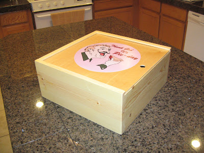
April also posted some pictures on her blog including a close-up shot of the lid that shows off how clean and sharp the picture looks when created with Inkscape.
Thursday, August 13, 2009
Pie Boxes - Part 1: The Box
A few months ago (wow...has it really been 4 months?) my sister made a request for a pie box like the one used on Pushing Daisies (a very scrumptious show that everyone needs to watch). Little did she know that I had already begun the planning of such a project, but now with her help I could get the dimensions right.
The inspirational box from Pushing Daisies.
I'll get into how the image for the lid was created in Part 2. For now I'll just address the box itself.
The box in the TV show is a prop and appears to be made out of 1/2" pine with butt joints. I don't think that box could carry a real pie. Or at best it wouldn't stand up to the use and abuse of the real world. I wanted to make a box that would work and last. Plus, based on the dimensions April provided me, her pie pans are on the large side.
The box I was to make needed to have internal dimensions measuring 13.5" square by 5.5" tall. I decided to use 3/4" pine for better strength. That then produces a box with external dimensions measuring 15" square by 6.5" tall.
Click on the image above to go to the 3D Warehouse where you can download the model.
I decided to give Google Sketchup a try for modeling the box. I could have used AutoCAD, but I liked that Sketchup made collaboration easier. I used to use Pro-Engineer back when I worked as a mechanical engineer, so I'm familiar with working with 3D models. Sketchup is really easy to use. It does lack some of the more sophisticated features of Pro-E, but it gets the job done. And free is always nice. It certainly was easier to make changes in Sketchup than in AutoCAD.
For the top and bottom I found some sanded 1/4" birch plywood that closely matched the color of the pine. For the joints I wanted something stronger than a butt joint. I gave some thought to dovetail joints or even a simple box joint. But for this project I was trying to maintain the look of the box from the show. So I went with a dado joint. The bottom of the box and lid fit into 1/4" dadoes. The bottom is not glued but is left free floating. The lid slides out one side.
If others want to make boxes of their own then I recommend adjusting the box dimensions to fit your pie pans. My own pans are typical 9", so when I make some of my own I will reduce the size to 10" square by 4" tall internal (or something like that, I haven't really worked that out yet). Others may also want to play around with different wood species and/or joint options. One nice thing about pine is it's very lightweight. Although it is harder to find straight pine boards at you local hardware store. It took some digging to find good ones. Be sure to avoid twisted, bent, or cupped lumber. Life is just too short. Time spent finding good stock reduces time in the shop.
The dado joints were a piece of cake. I've done dovetails and box joints before, so I'm equipped and not intimidated by the process. The blind and through dadoes I needed were created with a makeshift router table
The dadoes were just 1/4" so I cut rabbets in the adjoining piece to form a 1/4" tongue that fits the dado. The rabbets were cut on my table saw with a stacked dado head cutter. I did run into a little trouble here getting the rabbets cut to the right depth. Too deep and the tongues fit too loosely. Too shallow and there's no getting the joint together. After a little trial and error (and getting boards that are not cupped...see above) I was able to get things adjusted just right. I figured out that the table insert (that goes around the blade) was not adjusted evenly and was giving me a shallow cut on one side and a deeper cut on the other. I need to get me a better insert.
Also, I had forgotten how much pine tears when making cross cuts so a couple pieces ended up having the last little bit tear off. I was able to orient them so the worst offenders are on the bottom of the box though. Next time I will be sure to use a backer piece to help reduce tear out.
To finish it I had given some thought to using oil with a rubbed on wax finish. But after pricing that I just went with polyurethane. I used a Minwax Wipe-On Poly though to give it the same look and texture. I think it worked out well. April wanted to retain the natural pine look with no sheen, so I just used clear satin poly.
I gave all the pieces a good sanding with 120 grit sand paper (on my orbital sander) before glue up. After assembly and once everything dried I sanded with 220 grit (on the orbital sander). Wiped everything down with cotton cloth soaked in mineral spirits to get all the dust off. Then applied 3 coats of the Wipe-On Poly with a cotton cloth, sanding with 220 grit (by hand) between each coat (and cleaning the dust with mineral spirits). I gave it a final light (hand) sanding with 220 after the final coat.
This was my first time using the Wipe-On Poly. I think I really like it. Even though it's clear it did yellow the pine a bit, but that's typical for pine and it ended up matching the prop anyway. It doesn't make a very heavy or thick application, so I don't recommend it for floors or items that get some extreme use. The bottle suggests it to be used on furniture though, which I think would be fine. Three thin coats (to avoid nasty drips) seems like the minimum I'd apply. I was going to go for 4, but I ran out of time. It probably would have been overkill anyway. I used vinyl gloves which worked fine. I've had other stains and varnishes eat through latex, so best to avoid that.
As much as I like woodworking, I'm not a big fan of finishing. Not because it's hard. It's just the waiting around for things to dry that kills me. I do like the detail work and spending time sanding and smoothing...getting things just right. Applying the finish is always fun as you can start to see how the finished product is going to look. But then having to walk away for a few hours before you can do more just sucks away the fun.
The final touch was a non-slip drawer liner to prevent the pie from sliding around in the box and ruining that perfect crust.
In Part 2 I'll explain the "magic" that went into creating the picture for the lid.
Subscribe to:
Posts (Atom)