Saturday, December 26, 2009

Chainmail Tinkering

 
It's been a while since I posted any of my projects because I've been so busy with the projects themselves. One such time-intensive project is making some chainmail armor. After reading an Instructable on making mail I've been wanting to try the process out myself. It seems fairly simple.

Here are the 2 resources I've found most helpful: 

(I encourage visiting the source website for any updates, but just in case they are no longer available I have provided links to a PDF version of each.)

When I told David about my plans he got really excited about it and wanted to make some too. So we've been working together on this project. He's probably put in the most time so far with making rings and weaving his own shirt (with my help and guidance along the way).

Making Rings - 

I want 1/4" rings so according to the chart on the Mailmaker's Guide I would need to use 18 gage wire. I found some 17 gage galvanized electrical fence wiring at Ace Hardware, which seems close enough. At $16 for a 1/4 mile it's a good deal. While I was there I picked up a 1/4" metal rod, a couple needle nose pliers ("toothless" to prevent marring the rings), and metal cutting shears.

I had some spare plywood from a previous project that I used to construct a simple frame for the mandrel.
Ring forming station
Forming the coil around the mandrel was pretty easy. We picked up that skill right away. But cutting each ring from the coil took a great deal of learning and adjusting. At first we were cutting 2-3 at a time letting the jaws of the shear close all the way. This was causing the rings to open up and become misshaped. It would take only a few minutes to cut an entire coil (about 100 rings) but about an hour to reshape all the rings back into a round shape. There was no way this method was going to work out.
Misshaped rings need to be formed back into a circle

Eventually, David figured out that if you don't let the jaws close all the way, but just "nibble" off 1-2 rings at a time (letting the jaws bite into, but not completely cut the 3rd & 4th rings) then the rings don't open up. So this has been our method. After each "nibble" you have to pull the coil off the shears and let the rings come off the jaws, then carefully line the shears back up with the notches you left on the next rings so you can cut in the same spot again. It takes just a little bit more time to cut as you have to go slower and be more careful, but it saves a great deal of time.
Good cut ringsClosed rings
 
Video Link

Weaving - 

We started out by making a hauberk for David (following the pattern in the Mailmaker's Guide linked above) and speedweaving using the technique from the Instructable (linked above). I chose to start with this because it has very large areas of just standard weaving with only a few places to make expansions or contractions. I figured this would be one of the easier projects to start with. 

While I prefer the speedweaving method illustrated in the Instructable, David has come up with his own that I will illustrate below. I think either method takes about the same amount of time. The choice is really just a matter of preference. I like my method only because it gives the appearance of rapid progression even if you have to double-back.

David's speedweaving:
Modified speedweaving
Link the closed GREEN ring to the open RED ring, then attach the open RED ring to the mail through the 3 rings as shown above.

Since David has been doing most of the work on the hauberk (which is coming along nicely) I also wanted to do a quick and easy project. With our recent interest in Dungeons and Dragons I thought it would be cool to have a chainmail dice bag. It took some time to figure out how to do the contractions just right to round off the bottom of the bag nicely without getting the rings too bunched up, but I eventually figured it out. I also didn't want the metal rings to mark up my dice so I sewed in a satin liner. (Did I mention that satin is a pain to work with? The edges just fall apart with the slightest tug and it's so slippery. I eventually got it sloppily sewn together, but since it's inside the chainmail and won't really be seen I wasn't too concerned with the looks.) I finished of the top with a draw string. I'm really happy with the way it turned out.
Gaming dice bag (+1 AC)
After I finished it I looked online to see if this was a unique idea or if others had been making them too. Not only is it not unique (do a Google image search for "chainmail dice bag") but there are even kits. And just a few days ago I saw a video about one on the Make blog. Oh well.

So while David continues work on the hauberk I have also begun work on the coif (hood). I'll post pictures once they're all done.

Thursday, December 24, 2009

Halloween Costume 2009

It's nearly Christmas and I'm posting about my Halloween costume? Well, I'm a little behind, so I'm playing catch-up.

A couple months before Halloween, my sister-in-law went to a Disney convention where they had a large booth for Lost. She posted a picture of a Dharma jumpsuit that sparked the idea for me to make a Dharma jumpsuit for Halloween. I saw that ABC was selling a jumpsuit but it was more expensive than I would have liked, you can't choose the station logo, and you can't embroider your name/occupation on the pocket. I figured this wouldn't be too difficult of a DIY project.

Not from the convention...this photo was at Disney MGM Studios.


I searched around and found a similar project over at the Lost Blog. Unfortunately I was having a very hard time finding a jumpsuit. I tried the store mentioned in the Lost Blog post, but they were all out of my size in that color/style. But I did find a sewing pattern. It was time to call upon all the sewing skills I learned in 7th grade. (Not to worry, I had done a little bit of sewing since the 7th grade too.)

I bought the pattern, and enough material to make 2 jumpsuits (one for me, and one for David...another Lost fan in our family). I also bought the station patches (Orchid for me, Swan for David). Then I set to work.

The pattern was easy enough to follow. I didn't make any major mistakes. I did have to fudge a little bit on David's costume. The pattern didn't have an option for his size so I just made the smallest one (adult small) and it was too long. I just hemmed the legs and sleeves a little bit more than usual. Unfortunately the torso is still very long, but it doesn't look too bad.

The part I'm most proud of is the embroidery on the pockets. I was fortunate enough to be able to borrow my mother-in-law's embroidery machine. Lucky for me she is very much into sewing and has some very nice equipment. So I was able to add even more personal embellishments to the costume.

Station patch & pocket embroidery


The final result:

Dharma costumes

Sunday, August 30, 2009

Rocket Camera

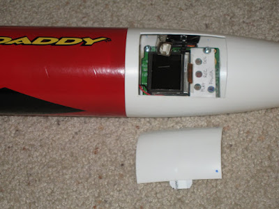
I finally finished the rocket camera project I started a while ago. Here's the finished product:


I got this idea from Make: Magazine. The original article is available in their online digital edition. Additional information related to the article can be found here.

All the instructions on how to hack the camera are available in the Make article so I won't bother repeating it here. More great information on hacking the camera is also available at camerahacking.com (that used to be the URL, but it currently doesn't work, the current working forum location can be found at camerahacks.10.forumer.com/)

More photos of the completed rocket:


I glued some tabs (cut from an old plastic card...actually an old Disneyland passport) to the inside of the hatch door to allow it to "clip" in place. It took several tries to get the tabs on just right. The first tabs I glued on were configured differently and glued with epoxy. The door wasn't too secure (it felt loose) and the epoxy didn't hold. I tried again with the current tab layout with hot glue. That didn't hold either, but the door did seem more secure. So I glued them in the same place with plastic cement and that seems to be holding up much better. They've held strong now for 2 flights.

I do need to glue some tabs inside the nosecone though to prevent the door from falling inside. On the second flight I thought I lost the door, but it actually just slipped up inside the nosecone.


I used ShapeLock (a low temperature plastic) to plug the hole at the bottom of the nosecone to prevent the gases from the engine from getting into the nosecone and ruining the camera. This worked out well. While the inside of the body tube (and even some of the outer part of the nosecone) show scorch marks, the inside of the nosecone still looks perfect.


The camera is mounted using plastic standoffs that were glued in place with epoxy. So far, after 2 launches, the camera mounts seem to be doing just fine. Everything looks the same inside after the second launch as it did before the first.


The smaller battery (replacing the 2-AA original batteries to conserve weight) was mounted in a location where it can be easily replaced when/if necessary.

Of course, with a project like this the blog post wouldn't be complete without actual video from the rocket so here you go.

Launch #1:


The first launch was a huge success. Everything worked exactly as planned. Perfect (and impressive) launch. This was my first time using "E" size engines. Perfect chute deployment and a soft touch down. The camera worked exactly as I hoped.

Launch #2:


With the exception of the chute failure, this was also a good launch. Three of the six lines completely ripped free from the plastic chute. I'm not sure exactly what caused it. From the video though it looks like the rocket gets inverted just before the chute is deployed. In that position (I'm guessing) that the chute began to open and the body of the rocket either fell through the chute and caused several lines to tear loose, or the shock of the heavy body snapping against the cords caused it.

It was coming down pretty fast and I was very concerned it was going to hit the ground hard. There was no way I was going to let that happen so I ran after it to catch it. And catch it I did! Staying clear of the flailing body and nosecone I grabbed at the parachute and prevented the whole thing from smashing into the ground. The damage is pretty minimal and easily repaired, so this Big Daddy is going to fly again!

Saturday, August 15, 2009

Pie Boxes - Part 2: The Picture

In Part 1 I documented the box construction. Here in Part 2 I'll be explaining the "magic" behind the making of the picture for the lid.

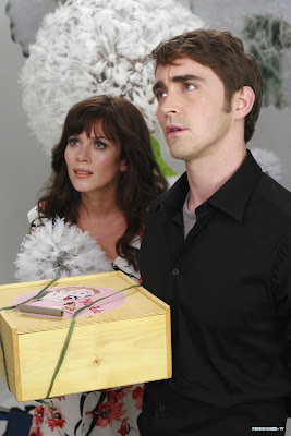
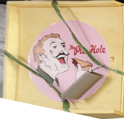
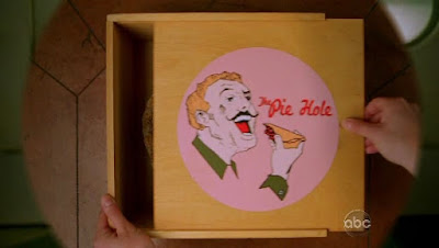
The box from Pushing Daisies has a very jolly looking man stuffing his face full of pie with the words "The Pie Hole" (the name of the Ned's pie shop). I scoured the web looking for the best possible image that I could use as a starting point. Unfortunately, one of the best ones I've found is shown below.


It's a great shot of the stars of the show, but not such a great shot of the image on the box. But it was the best I had so I gave it a try.

With GIMP I used the shear tool to stretch and manipulate the image until I had the picture as truly round as I could tell.


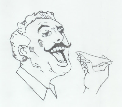
But the picture needed to be cleaned up significantly. Even if it's possible, my GIMP skills aren't good enough to remove the green string and improve the picture quality. So I took it to the analog realm. I printed it and traced it with pencil, then scanned the pencil sketch back into the computer.


Some of the image was too fuzzy and half of the hand is missing, so some guesswork was involved.

After scanning it I used Inkscape to convert the bitmap into vectors.

A quick word on image editors: GIMP (or Photoshop and equivalents) are pixel editors. When you resize an image it either just makes the pixels bigger (making everything look "blocky") or it has to extrapolate information from the nearby pixels to make more pixels (making everything look "fuzzy"). The nice thing about Inkscape (or Illustrator and equivalents) is that it uses vectors - lines - to create the image. Of course, the computer is still displaying the lines as pixels, but the software doesn't need to guess at what the pixels should look like when resizing the image. The vector information tells it everything it needs to know. You can take a 1" x 1" image and blow it up to 10" x 10" and it will look just as good.

Of course, there are limitations to vector graphics as well. They are really only suitable for working with illustrations, not photos. But since I was working with an illustration here it was going to work out nicely.

Converting the drawing from a bitmap to vectors is easy in Inkscape, but getting things to look the way you want takes some fiddling around with the tool. I don't remember the exact settings I used for this particular image. But it's pretty easy to just tweak the settings, test, and adjust as you go. After I had the line drawing converted to a vector graphic I was more easily able to clean it up. There were a few "blotches" here and there that needed to be removed. Some holes that had to be filled. And some of the lines were not as smooth as I wanted and had to be smoothed out. I did like how the lines had a bit of texture to them so I left most of that in. I think it adds to the look.

I used the reference image to add color by just using the color picker tool. When using this tool if you just click on the reference color you are actually only selecting a pixel. And since the colors are usually made up of pixels of various colors (especially in this case) you may not get the color you wanted. But Inkscape gives you the ability to sample an area and it finds the average color.

Then after I finally had it looking the way I wanted, I was watching a newly aired episode of Pushing Daisies and they actually showed a pie box in a nice clear shot from the top down.


Ugh! I sure could have used this image earlier. It would have required all the same steps except the need to stretch it out to get it shaped right. But this image showed the missing wrist detail that I was missing from my other reference. So a little nip here and a tuck there I filled in the missing pieces and had a complete image.


April wanted the name of her blog on the image for her boxes. No problem. The text tool made that simple enough.


I have high resolution images available for download for anyone that wants them. They're available in JPEG, PNG, or SVG (for use with Inkscape or other vector graphic editors). I have 2 versions. One that has the text "Thank God It's Pie-day" and the other with the original "The Pie Hole."

You'll find the files here. Just right-click on the file you want to download, select "Save link as..." from the pop-up menu, then save it to a directory on your computer.

Feel free to alter and edit them for your own use. All I ask is that you don't make a profit off the image itself. Not that I personally care. But ABC might have something to say about it.

If anybody makes any significant improvements to it (especially to the Pie Hole text which I'm not entirely happy with how it turned out) please share it back with me. Just comment below and let me know how to get it.

Trying to find a way to put the image on the lid gave me the most concern. On the prop all they did was tack on a piece of paper. Again, for a prop that's fine. But in the real world it won't hold up to real use. And as you can probably see from the reference images, even the prop isn't holding up well with edges curling up.

Some ideas I tossed around in my head were:

1. Iron-on transfer - This would require some testing to see how well it would transfer to wood, if it would hold up to application of polyurethane (or other finishing products), and if it would hold up to use. But since I needed a 10" image (to get the right proportions) this idea was shot down. The largest I can print on transfer paper is 8".

2. Laminated paper - Wouldn't look good.

3. Professionally printed on vinyl or plastic - Too expensive. I was quoted $35/print.

4. Painted on - This would look great and stand up well. But I don't have that kind of skill. If you can do this yourself or find a skilled friend I highly recommend this option.

5. Printed on photo paper - Photo paper is water proof (it goes through a wet process to get developed). If it gets wet just don't scrape it or wipe the water off. Just let the water run off and air dry it. And it's heavy enough that if glued properly it shouldn't curl up or tear. And Costco can do large format prints for just a couple dollars. So this was the option I chose.

I exported the image at 300 dpi and 12" x 18" and sent it to Costco. (The above downloads are the same size and resolution.) Glossy photos tend to show finger prints, so I chose the lustre option instead (a non-gloss finish). The next day I picked up the photos, cut them to size, and glued them on. (This is after the lids had been finished with polyurethane.)

I used regular Elmer's white glue, spreading it evenly on the back of the photo with a sponge brush (making sure to go all the way to the edges) and laying it carefully in place on the lid. I then spread a piece of wax paper over the top and used my hands to press and wipe from the center outward, spreading the glue towards the edges and letting a little of it seep out. The big trick here is using enough glue to get good coverage but not so much glue that you have a big mess to clean up. I made a couple mistakes of having a little too much glue.

White glue cleans up with water, so I used a wet cloth to carefully wipe around the edges, being sure to pick up the glue and not just spread it around. Some of it was getting onto the photo, but wiping carefully it will clean up.

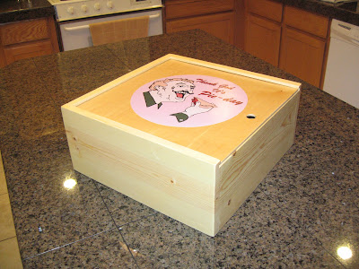
One last look at the final product...


April also posted some pictures on her blog including a close-up shot of the lid that shows off how clean and sharp the picture looks when created with Inkscape.